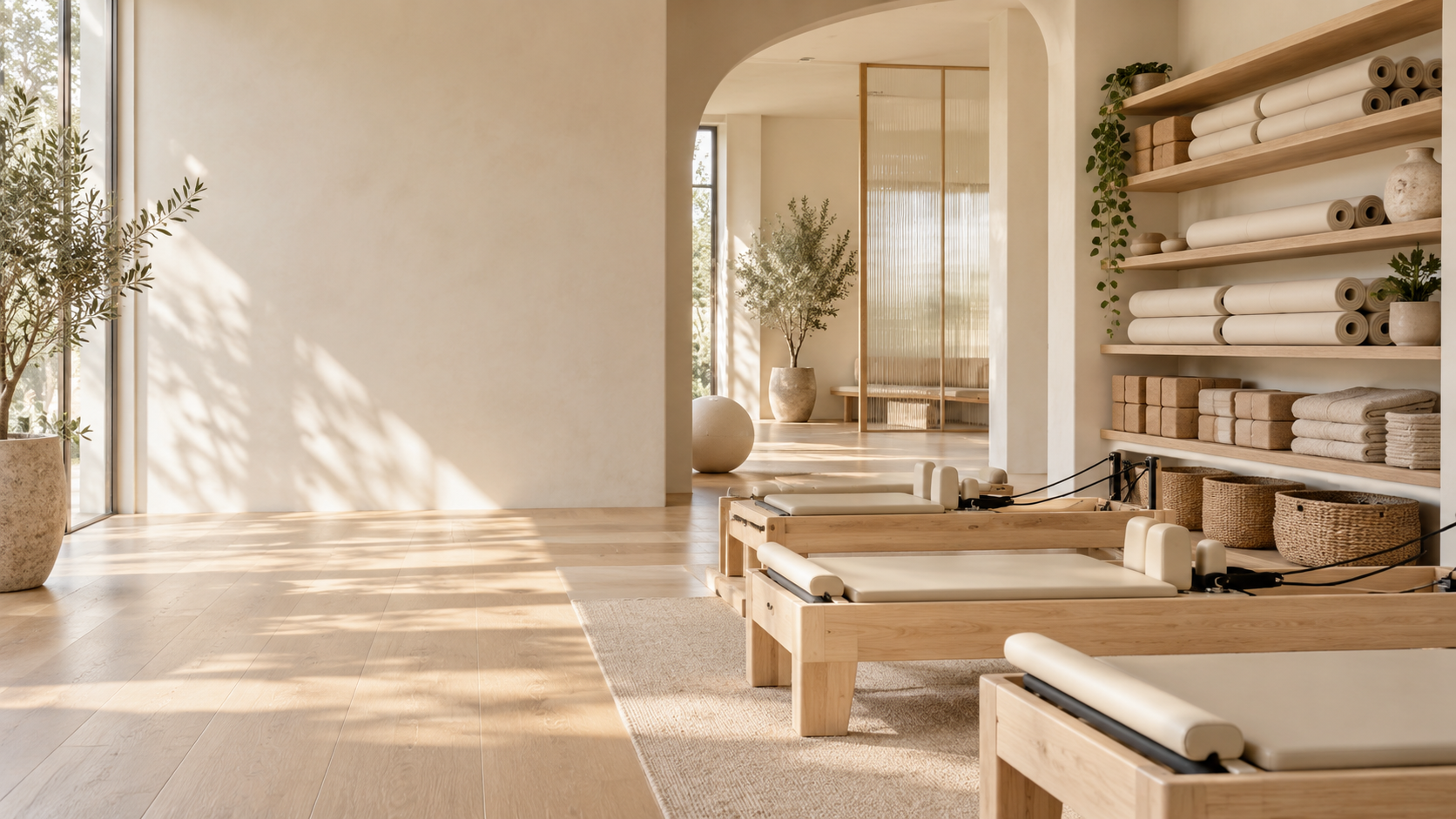
A cohesive studio does not rely on one perfect product colour. It begins with a shared visual system.
A studio can have beautiful walls, well-made equipment and carefully chosen accessories — and still feel unsettled. The usual reason is not that any one choice is wrong. It is that the choices were made separately.
When wall finishes are fixed before equipment is considered, the products can arrive as a late visual layer: mats feel too cool against warm timber, storage introduces a new tone, or a collection of individually appealing colours starts competing for attention. In a movement space, where calm and clarity matter, those small clashes become more visible.
The better starting point is to treat the room, equipment and storage as one colour system. This does not mean matching everything. It means deciding which colours should lead, which should support, and where a small contrast is useful.
01
Set the main, supporting and accent colours first
Before choosing individual products, define three roles for colour in the space:
- Main colour: the visual field that appears most often — usually walls, flooring or large joinery.
- Supporting colour: a quieter companion for larger product groups, such as mats, Reformers, benches or shelving.
- Accent colour: a controlled note for small accessories, textiles, signage details or planting.
This order makes decisions easier. Instead of asking whether a mat is attractive on its own, ask whether it supports the room’s main colour and keeps the overall mood intact. A restrained palette also leaves more room for material character: oak grain, woven fibre, plaster, linen and soft-touch surfaces can create depth without introducing another strong colour.
02
Coordinate mats, blocks, towels and storage as one layer
Products are most convincing when they feel considered at the same scale as the room. Start with the largest and most repeated item — often the mat — then build outward.
For example, if the room is warm ivory with pale oak, a cream, mist-grey or pale-beige mat direction can keep the space light. Blocks and towels can sit one step deeper in tone, while baskets or closed storage can absorb the most practical visual weight. The goal is not uniformity. It is a rhythm: broad quiet surfaces, then smaller material or colour changes that give the room texture.
Storage deserves attention early. Rolled mats, folded towels and small accessories are visible in quantity; even when each item is simple, their combined colour reads like a large surface. Planning that surface alongside the walls and flooring prevents a finished room from feeling like products were added afterwards.
03
Three starting directions
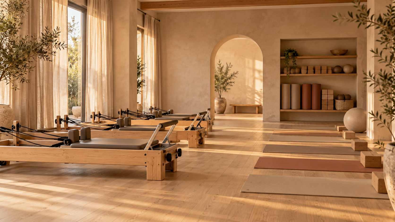
Warm natural
Palette: warm ivory, sand, oatmeal, camel, soft clay and pale oak.
Let warm plaster, oak and woven materials form the background, then use oatmeal and camel for the repeated equipment layer. Keep contrast soft so the room reads as calm rather than themed.
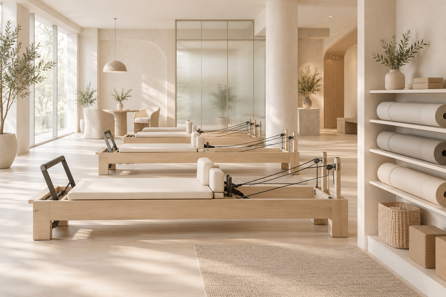
Quiet neutral
Palette: milk white, fog grey, pale greige, soft cream and light ash.
Use milk white and pale greige for the architecture, then let mist-grey products create gentle definition. Cream textiles can warm the palette back up.
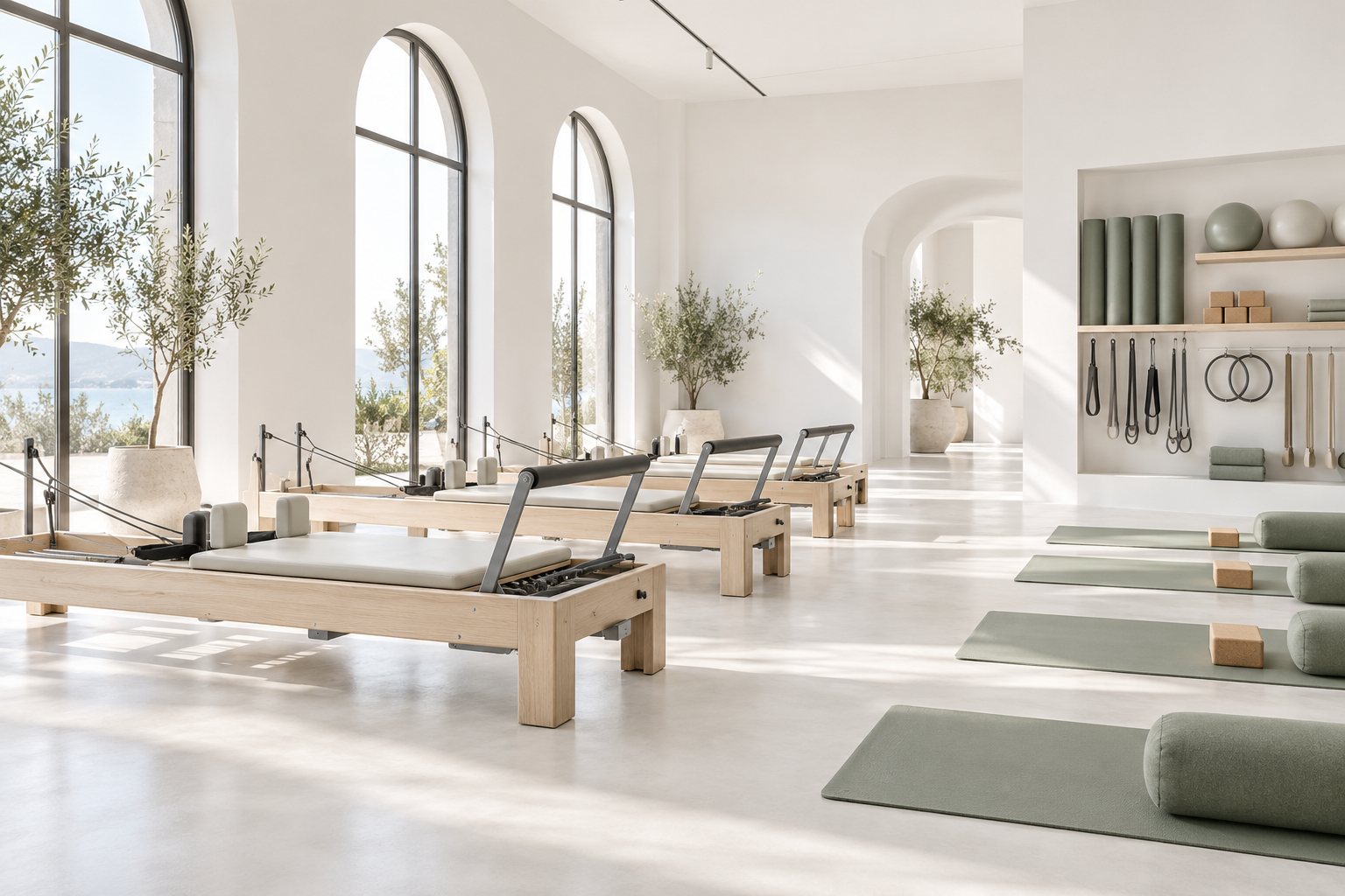
Fresh modern
Palette: warm white, pale oak, mineral blue-grey, soft cream and restrained sage.
Keep the room warm and quiet, then introduce a muted blue-grey through the product layer. Paired with warm white walls and pale timber, it adds freshness without breaking the visual calm.
04
Questions to ask before the project begins
- What feeling should a visitor have on entering the space: grounded, quiet, fresh or energetic?
- Which surfaces will be seen most often — walls, floor, joinery, storage or equipment?
- What product group will appear in the greatest quantity, and what colour role should it play?
- Where is contrast useful for orientation or visual interest, and where would it become distracting?
- How will mats, towels, blocks and accessories look when they are stored rather than in use?
- Which colours need to work across different daylight conditions and photography?
- Which finishes are fixed, and which can still be adjusted before procurement begins?
Design the system, not isolated objects
A cohesive yoga studio is not created by matching every item. It comes from making colour decisions in the right order: first the atmosphere of the room, then the repeated product layer, then the small accents that bring the space to life.
Starting that conversation before procurement gives a project more room to balance material, tone and storage in one view. The result can feel quieter, more intentional and easier for guests to remember.
Illustrative colour-direction visuals only. They do not depict a confirmed customer installation, a specific product model or an availability commitment.