
LAYOUT REFERENCES
Compare layout starting points
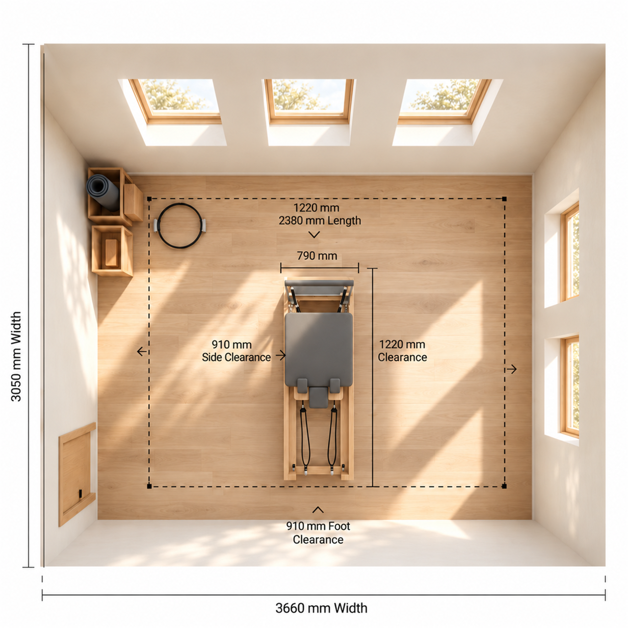
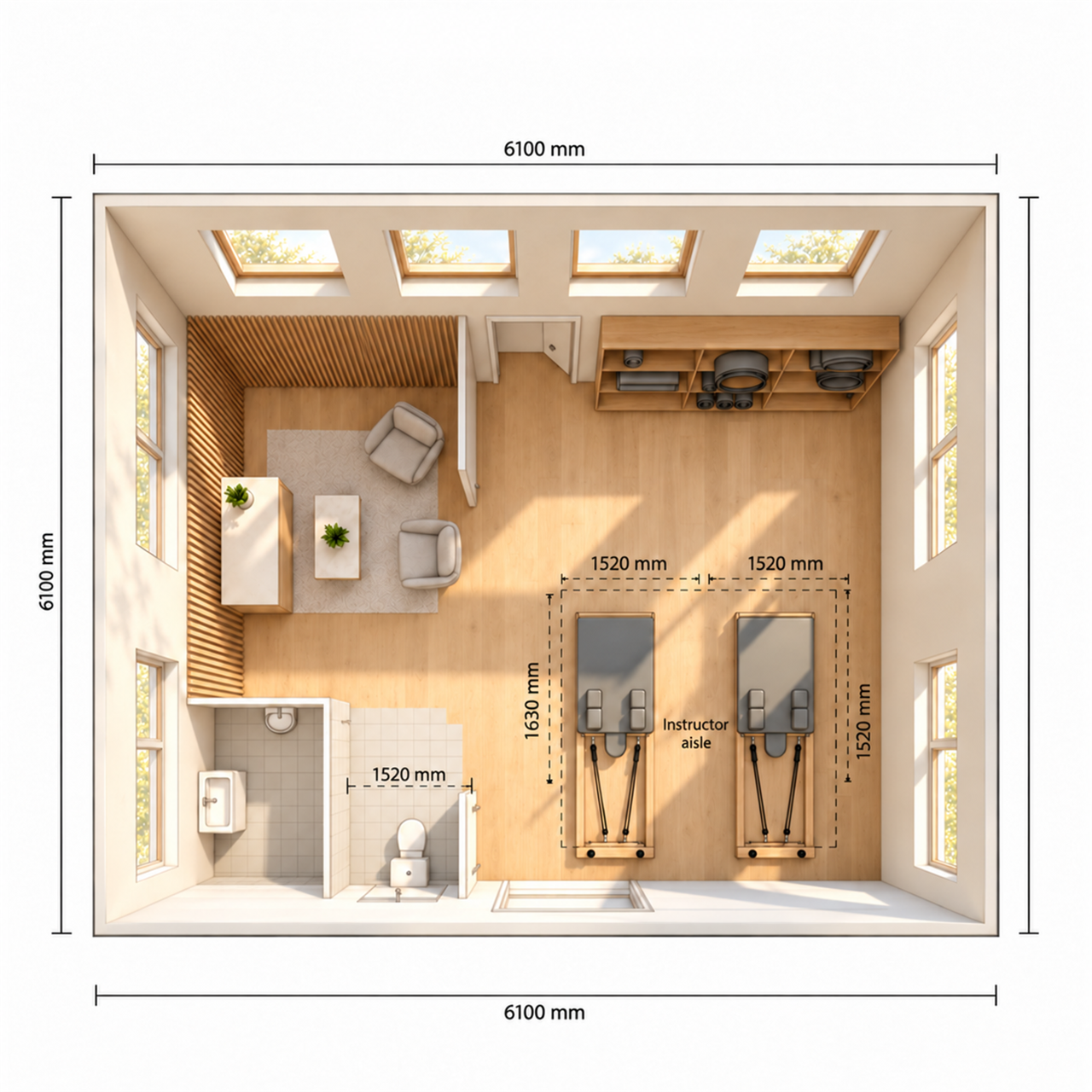
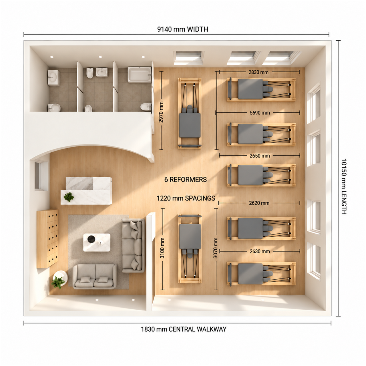
These are illustrative discussion references only; they do not confirm dimensions, clearances, capacity, safety requirements or a final studio configuration.
COLOUR DIRECTION LIBRARY
Make the space and equipment read as one system
Start with the atmosphere the studio should hold, then coordinate wall, floor, light, Reformer upholstery, yoga mats and small accessories around that shared direction.
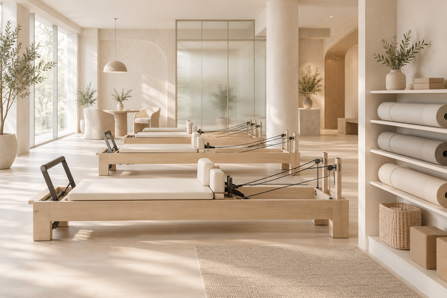
Milk and ivory
A soft, light-filled setting where material depth carries more weight than colour contrast.
- Space direction
- Build the background from ivory, milk white and warm greige, then introduce texture through plaster, glass, woven surfaces and oak.
- Product pairing
- Use cream, mist-grey and pale-beige mat directions with light timber Reformers and restrained hardware.
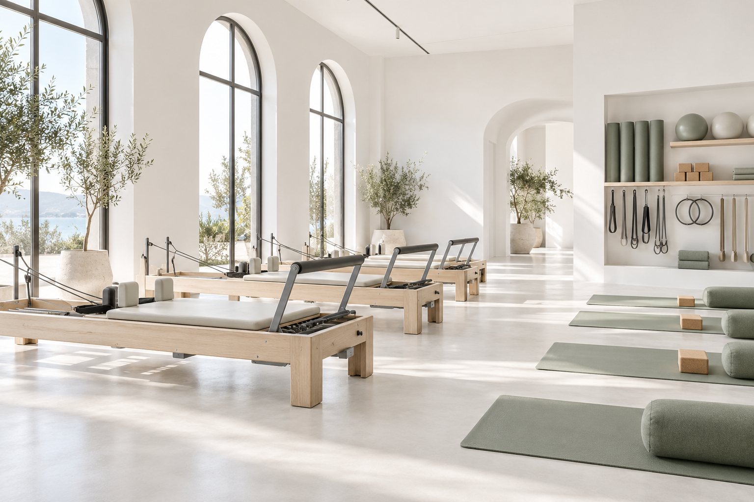
Pure white
A clean, contemporary canvas that lets one carefully chosen colour family do the orienting.
- Space direction
- Let white carry light and openness; define zones through subtle texture, pale timber and fine grey outlines instead of visual clutter.
- Product pairing
- Choose one calm accent family—such as muted sage, mist blue or clay—for mats, soft goods and selected accessories.
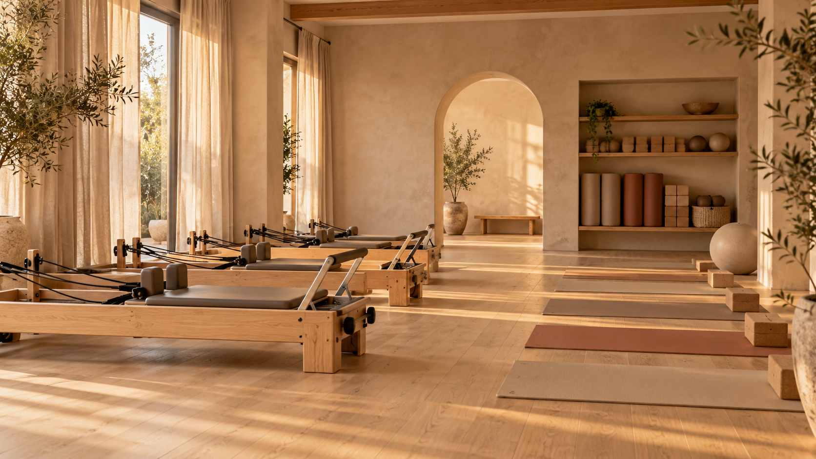
Sand natural
A warm, restorative route led by light timber and low-saturation earth tones.
- Space direction
- Layer sand, flax and pale oak through soft daylight, matte walls and tactile storage rather than strong contrast.
- Product pairing
- Keep yoga mats, blocks and accessory directions within oat, clay and muted terracotta families.
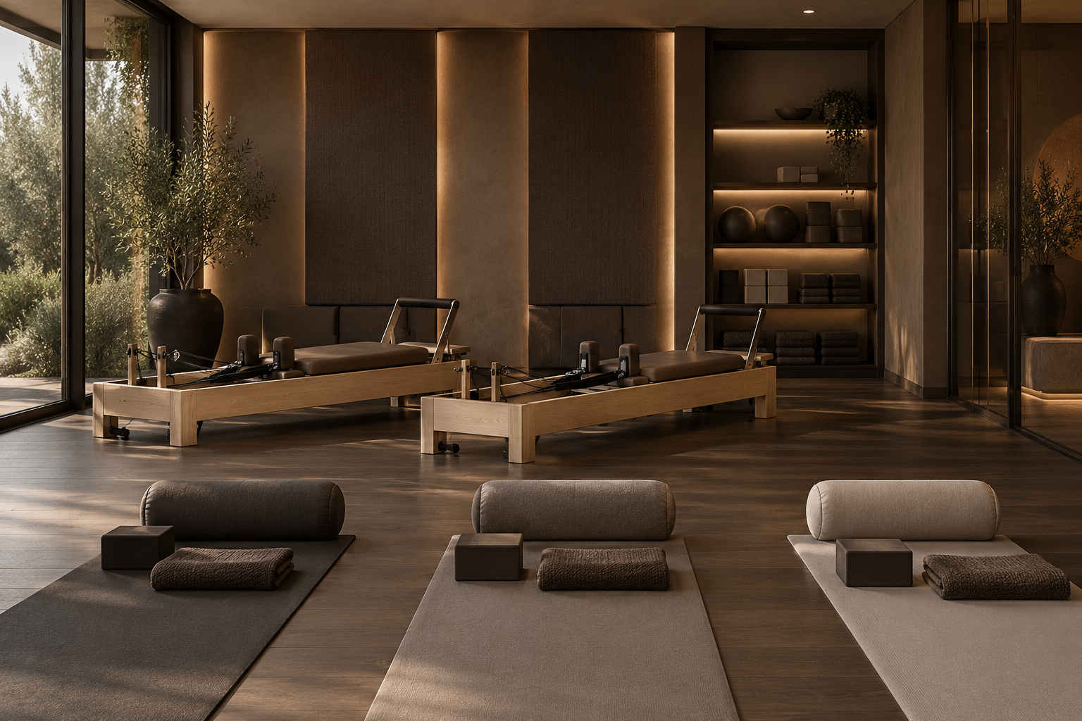
Deep taupe
A grounded, premium base for an intimate boutique setting.
- Space direction
- Use dark taupe and cocoa as controlled anchors, with warm light and lighter planes to retain clarity.
- Product pairing
- Coordinate mushroom, charcoal-taupe and oatmeal mat directions with darker Reformer upholstery and pale timber.
Use accent colours as a restrained secondary layer
Accent colour can help distinguish a training zone, reinforce a visual identity or make equipment easier to read as a coordinated group. It works best when the main field remains calm and the accent is repeated selectively across a few relevant touchpoints.
Illustrative discussion guide — not a final studio design or product specification.
Prepare your project brief
Select the discussion inputs most relevant to your studio.